

One of the best ways to communicate about technical designs and processes is with visuals.
A large body of research indicates that visual cues help us to better retrieve and remember information. The research outcomes on visual learning make complete sense when you consider that our brain is mainly an image processor (much of our sensory cortex is devoted to vision), not a word processor. In fact, the part of the brain used to process words is quite small in comparison to the part that processes visual images. – Psychology Today, Learning Through Visuals)
Images convey ideas and structure far more effectively than text. Especially for software systems, they can even help with reasoning about things like capacity, connectivity, reliability, security and performance.
Like any craft, methods of designing visuals that communicate effectively and efficiently can be studied and improved. We have probably all seen diagrams which led to an immediate “aha!” – and others, that after minutes of squinting, led to only more confusion.
As a full-time Architect (the computery kind, not the making buildings kind) I end up looking at a lot of diagrams. And a lot of them (even the ones I made in the past, that I’m revisiting) leave me with The Squinty Face Of Confusion™.
This post is the result of trying to ask the question – “can we do better?”
As a short aside, technical diagrams aren’t incredibly unique, and much can be learned from others working on “effective visualization”. For example, not all lessons are totally portable to system and process visualization, but much of what Edward Tufte spent his life developing is very relevant. For a good high level firehose of some of the ideas, this slide presentation is pretty approachable. (Thanks to Bob Marshall for the reminder.)
What’s captured here includes advice from Tufte, as well as many others, that’s focused on the particular domain of technology systems and processes.
General Guidelines
Diagrams come in many types, and can communicate many different things. The second part of this post explores some specific types of diagrams. However, across all types, there are some general guidelines which can universally improve communication effectiveness.
Guideline #1: Limit Complexity Per Diagram
If your diagram has 200 elements in it, it’s going to be hard for a person to understand what’s going on. While there’s no hard rule, even keeping track of more than 20 things can be difficult. It’s often far simpler to show a collection of comprehensible diagrams which focus on different areas, including high level diagrams to tie them together.
Some strategies to refactor a busy diagram include:
- Zoom In / Zoom Out: For a high level diagram, perhaps you’ll show how 3 microservices are connected, but just depict those microservices as simple boxes. In another (zoomed in) layer, you could show how that microservice is implemented.
- One Thing At A Time: It’s common to try and draw a system diagram that shows everything at once; how the system is built, security mechanisms, infrastructure, logging and metrics, what components call each other and how, data flows, and more. If a diagram is too busy, it can be helpful to have one which just lays out the infrastructure, or just depicts data flows, or just shows backup processes.
Useful lenses that might be worth applying to a design to yield a set of comprehensible diagrams are:
- Static Architecture. What does the service look like ‘just sitting there’
- Flows (of data and calls) as a function of various processes, one process per diagram
- Authentication and Authorization boundaries
- How deployment works
- How changes are made, if different (e.g. to configuration, or a new version release)
- Backup processes
- Failure modes or failover processes
- Observability (Logging, Metrics, and Trace) integration points
- Technologies in play
- Network architecture
- AZ / Regional relationships
- State changes based on inputs
For a structured way to limit complexity per diagram, check out the C4 Model (c4model.com), which proposes 4 types of standard views:
- System Context, or a high level diagram showing how your systems fit into the overall business context of users and other systems
- Container Diagram, a zoomed in way to show the major ‘logical chunks’ of software inside your system, what techs they use, and how they communicate. (Note: I find this term confusing because ‘containers’ are a specific technology, while it’s being used more abstractly in C4, but it’s still a good idea.)
- Component Diagram, a further detailed view of the inside of a given Container and how it operates
- Code Diagram, how the code inside a given component is structured
The C4 Model targets the ‘static architecture’ of a system, and is only one of many ways to help understand the design and functionality.
If this topic interests you, I highly recommend reading Simon Brown’s Software Architecture For Developers, which helped me greatly in thinking about how we can both architect and communicate architectures better.
Guideline #2: Make Every Difference Significant (and documented)
Any difference in your diagram can and should be a part of telling the story. It’s great to use multiple font faces or sizes; but if you’re going to do that, it should have a reason, and a key. (e.g. “Fixed Width Fonts used for labeling protocols”)
This can be true of many things.
- Lines: color, weight, style, and arrowhead types
- Boxes: shape, fill style, colors, shadows, borders and relative size
- Fonts: faces, weights, and sizes
- Icons vs Not Icons: If you’re going to use icons for services, be consistent. If you use a bucket icon to represent S3, and a regular box to represent a kinesis stream, that’s confusing.
Guideline #3: Label All The Things

Things that should be labeled include
- A title for the diagram itself (what it’s depicting)
- Legends for any significant colors, line types, arrowheads, etc
- Every Icon (try taking the AWS Icon Quiz to prove to yourself that this is important)
- Definition for any non-obvious technical jargon (acronyms or technology names)
- Every edge:
- What relationship or process it represents
- What protocol, if applicable
This last point is important. It’s common to see diagrams that just have bare links between services:

It’s a lot more helpful to actually see what’s happening with some more detail:

Guideline #4: Think about Legibility
The strategies in ‘Limiting Complexity’ help keep you from having to juggle too many things in your diagram. Beyond that, there are lots of things you can control that will make your diagram more understandable.
- Think about flow. At least in western cultures, we tend to scan diagrams as either top-down or left-right. Make it obvious where your reader should ‘enter’ and how they travel through your diagram.
- Think about whitespace. Where and how you use space can really impact legibility. Diagrams that are too crowded end up being hard to trace, but the same can be true if they’re too sparse.
- Make every pixel work for you. Tufte calls this the “data/ink ratio”. How much of the ‘ink’ in your diagram is actually conveying meaning, and how much is purely stylistic or decorative?
- Think about colors. This is a massive field, but colors can have a
huge impact in how legible your work is.
- Colorblindness of some type impacts many people, so it’s very important to account for. Here are some resources to help selecting palettes and also visualizing how your work looks to those who have it. (One key takeaway: consider color+texture instead of just color.)
- From a design standpoint, It can really help to work from a consistent color palette across related diagrams. See material.io canva palettes, and color hunt, colorbox.io for inspiration. If you really want to go down the rabbit hole, this udemy course looks useful.
- Avoid crossing lines. The human mind has a hard time tracing routes through line intersections. This can be especially tricky if you’re showing that things are contained by another thing. One method for that is to use colored, borderless boxes for containers:

Types of Diagrams
There’s no need to use specific styles or types of diagram, but sometimes established patterns are the most effective ways to communicate meaning, or at least can serve as inspiration.
Good ol’ Boxes and Arrows
This is the most common type of diagram, and it’s what most often gets reached for at a whiteboard.
These diagrams can be great! They’re usually simple to understand, and because they’re ad-hoc, they don’t have a lot of implied ideas about shapes having special meanings.
There are some conventions – like cylinders for data stores – but they’re used differently enough that as long as you label things, you can get away with a lot, and still have a good diagram.
The biggest challenges with box and arrow diagrams are that they are too flexible. As discussed previously, if what you mean by connecting two boxes with an arrow isn’t explicitly called out, and you use them inconsistently between cases, it can be very confusing.
Boxes and arrows diagrams can also fall down when trying to talk about things happening over time.
For example, this is an attempt to depict a TCP 3-way handshake. It’s reasonably successful, but it’s hard enough to comprehend with 3 steps and 2 boxes. Tracing complex changes over time involving lots of actors is a better fit for Sequence or Swimlane diagrams.

If I end up feeling like I’m playing hide and seek trying to find “hm, where is step 7”, I’m probably not building a good mental model.
Sequence Diagrams
Sequence diagrams display a sequence of actions between different ‘things’ (usually called actors, in sequence-ese) over time. They usually have the actors as boxes at the top – and sometimes at the bottom as well, which helps legibility if a number of actors are involved. They then have vertical lines which flows can be attached to. It’s much easier to see clearly what’s happening over time, as they’re read top to bottom.

Sequence diagrams can be drawn with almost any tool, but there’s several which allow them to be created from text-based markup formats, like plantuml, websequencediagrams, and mermaid.js.
However, they can get hard to read beyond a certain scale, especially when they’re generated by an automated tool. When that happens it can be a clue that it’s time to break a given process down into different subprocesses. For example, you may have a sequence diagram that shows an API gateway flow, which involves authentication, authorization, rate limiting, routing, and logging. That’s probably the right level for a single diagram – showing the various backends that are queried for each stage might be better as a secondary, zoomed in set of diagrams.
Swimlane Diagrams
Similar to sequence diagrams, swimlane diagrams break down into actors as well. They could be services, or people, employee groups, or vendors.
Swimlane diagrams offer the ability to notate both the edges and the nodes. In this case, consider the same example, where we’re also talking about the internal TCP engine state at each end.

Flowcharts
Flowcharts are probably the most common diagrams used outside and inside of engineering. They’re usually used to describe a process, algorithm, or system. Flowcharts do have some typical symbols:
- Diamonds for decisions
- Ovals for inputs
- Boxes for states
- Edges labeled based on the selected option
While they can be created in almost any drawing tool, they are also supported by many of the same markup-driven tools, including mermaid.
For example, the process of writing, as a Mermaid flowchart.
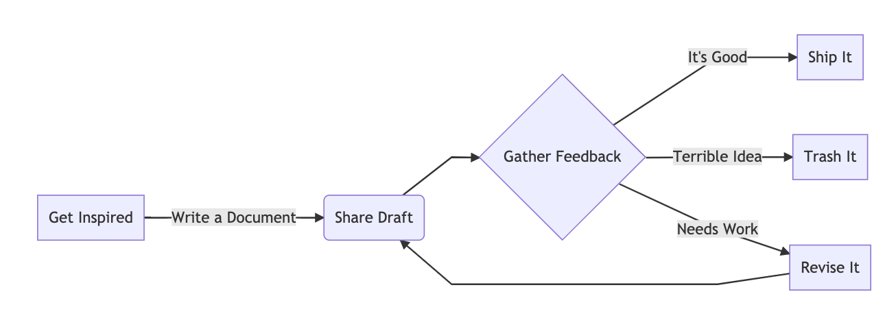
And for completeness, the markup to render this particular diagram:
graph LR

A[Get Inspired] -->|Write a Document| B(Share Draft)
B --> C{Gather Feedback}
C -->|It's Good| D[Ship It]
C -->|Terrible Idea| E[Trash It]
C -->|Needs Work| F[Revise It]
F --> B
For more fun with mermaid, including a cool way to embed the markdown in the metadata of the image, check out my post Make-ing Mermaid.
State Machine Diagrams or State Charts
State diagrams, on the surface, seem very similar to flowcharts. They are also (with some small variations) called State Charts.
However, they’re generally inside out, compared to flowcharts. What’s inside the boxes/circles is the state – and what’s on the edges is generally the things that change the state.
State Charts are awesome, and can actually be used to drive very elegant software architectures. For more, check out Welcome to the World of Statecarts.
Here’s an example of a hypothetical technical documentation process. In this world, all technical documents need to get reviewed by a critical mass of other people. If those reviewers provide feedback, the author needs to take a pass at integrating that. Once enough people have reviewed the final document, the author can consider it to have been reviewed.
In this diagram, the bubbles track the state of the document itself, and the edges track the reasons it might go from one state to another.

One of the reasons I like these diagrams in particular is that it can lead to insights about gaps in the design. “Oh, I can’t get from A to B without taking a long trip through D, E and F, but there’s actually a case where we do go from A to B, we forgot about it.” It can also help watch out for cycles, or other places where your process may go to die.
Also, making a state chart first can lead to some very clean code, as it helps think about what the state really is, and how it changes, often leading to a more coherent logical structure.
What are your favorites?
There are many more types of diagrams that can be really helpful, and I’d love to expand this document both for others and to add tools to my own visual communication toolbox. Share your own examples with me on twitter (@jbarratt).
Diagramming Tools & Techniques
Overall Process of Diagramming
I like to think of diagram design as a 4 step process:
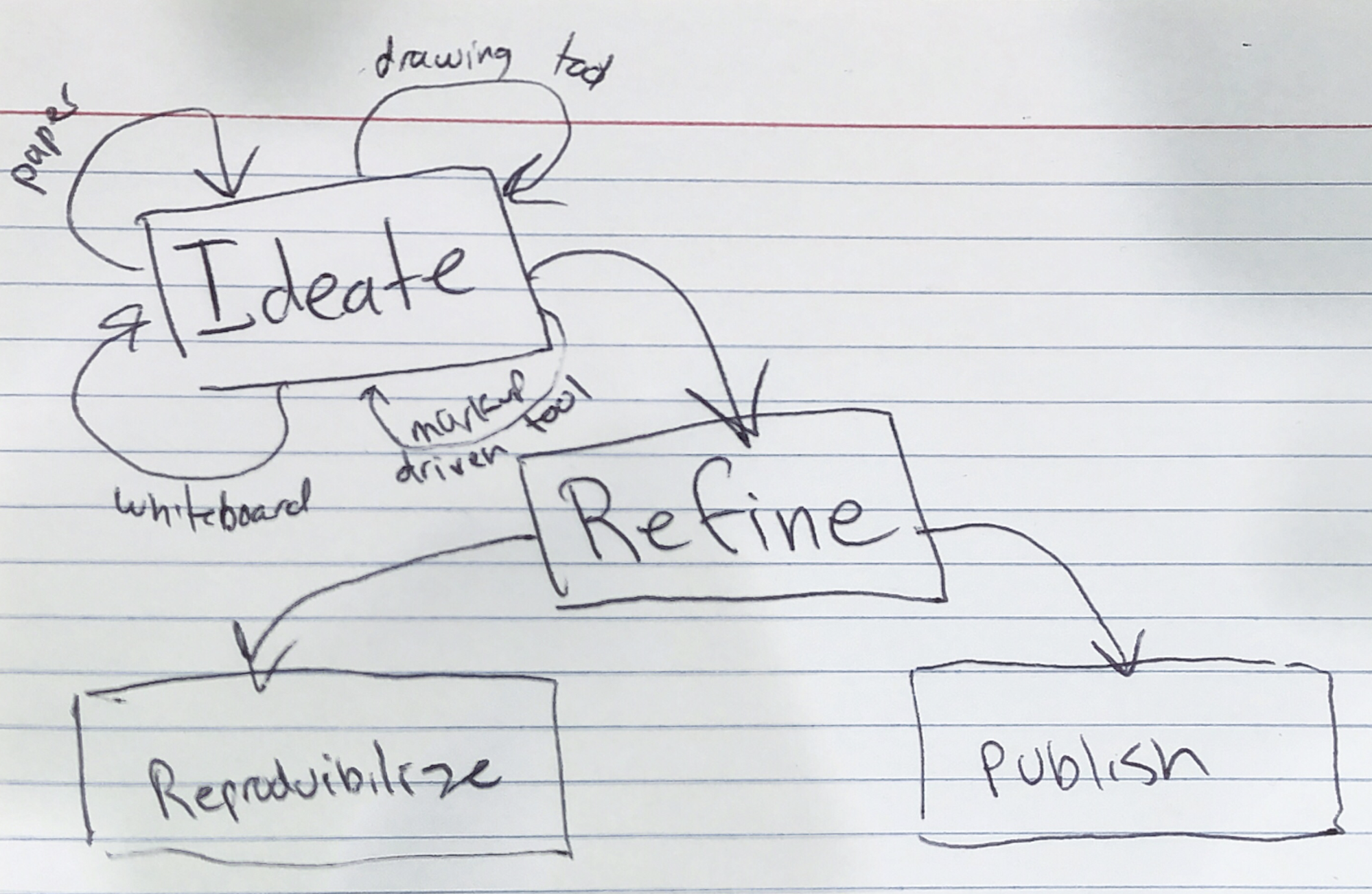
- Ideate – come up with lots of ideas about how to commnicate something
- Refine – select an approach and tweak it for effectiveness, using the methods described in this post
- Publish – share the document, and get feedback
- “Reproducibilize” – ensure that if you (or others) need to change the diagram later, that’s easy
Ideate
Ideation (coming up with your ideas) is the messy part.
Don’t worry about legends, legibility, tooling, or beauty. Just get your design out there, and tweak it. You can use a whiteboard, paper, index cards (see above), or stickies plus a whiteboard, which can be a good way to keep the boxes tidy while playing with the arrows. This is a good time to get quick feedback from other human beings.
“I have a model in my head that I think this is a picture of. What model does it create in your head? Let’s make sure they match.”
Another tool type that can be good for ideation but might not be where you want to end up is the markup tools (mermaid, graphviz, websequencediagrams, etc). They’re quick to work with, if you get familiar with the dialect, but their outputs aren’t always very legible. They can still be useful sandboxes to go back and create a more polished output from.
Refine
So, why bother with ‘refinement’ – making a diagram more effective, perhaps using some of the techniques talked about in this doc?
Well, sometimes you shouldn’t. If a photo of an index card does the job, stop there!
Often, though, a clear and effective diagram is a tiny investment of time compared to how much impact it can have. An engineering diagram for a long-running service might be consulted hundreds of times, sometimes even by “future you.” A diagram of an interface or integration point (say, for a platform service) is even more likely to be well worth every minute spent on it.
Diagrams can also help convey ideas, process changes, or plans with a large amount of clarity. I might only get one chance to try and change people’s minds, who are considering between a few paths. An effective diagram can very much change the course of a discussion.
Publish
Publishing probably goes without saying – how do you get the diagram out there? Often, it doesn’t matter. Choose the appropriate medium for the group you’re working with, and make sure you’re giving the diagram the stage it deserves, with the right resolution and strong supporting text.
I’ll throw out a blanket plug for SVG here: As an output format, it’s incredibly versatile, especially if you’re going to have your diagrams displayed on the web on screens as small as a mobile phone and as large as a 4k monitor.
Reproducibilize
There’s got to be a word for this that I don’t have to make up.
“The act of making your diagrams reproducible, or modifiable in future.”
Plans change over time, and your diagrams should too.
- Is it easy for you to make a change to the diagram in the future?
- Is it easy for other people who might take ownership of the documents and diagrams in the future to do the same?
If you’re using a graphical tool, this means making sure other people have access to the source files and know how to work with them.
To eat my own dog food here: you can download the OmniGraffle file used to create all the diagrams in this post. (Thanks for the idea, @mrwacky42.)
Fundamentally this is another reason SVG is an interesting format. If I make an SVG file in any tool, even if it’s in something like OmniGraffle, it can still be opened and edited in tools like Inkscape, something which can’t be done if you’re sharing raster versions of your files.
There are a vast number of tools out there, a few of which are listed below.
Some of them (like the drawing tool built into Google) are ideal from a reproducibility standpoint. If you have access to the doc, you have access to the diagram, and you can change it if needed using the tools right on the page.
However, I personally struggle with these tools. I find them slower to use and that they generally create less comprehensible output. It’s an uneasy balance. My personal go-to tool for almost a decade has been Omnigraffle (now on MacOS and iOS/iPadOS). I have a personal license for it. When I’m working on diagrams for work, I’ll save the files in the company Google Drive, but it’s not ideal. A future document maintainer would have to know where to find them, have permission, and have a license to the tool.
It’s currently an acceptable tradeoff to me – worst case, recreating a diagram in another maintainer’s tool of choice doesn’t have insane overhead, and it’s worth it for the impact such drawings can have.
But it’s worth considering and ensuring that at the very least you have the ability to come back to your diagrams and revise them quickly.
Tools List
There are many tools out there, and they vary in many ways. Some do a great job of making certain types of diagrams simple to make (e.g. mermaid) but also can be very limited if what they do isn’t quite what you want. Others (like Visio or Omnigraffle) have access to lots of stencil libraries, which can be a helpful way to have consistent but also impactful graphics to go along with your designs. Some (like cloudcraft) are even more opinionated about the types of diagrams they make and what they make them of.
Here’s a selection of the ones I’ve run into the most frequently; there’s also a good list at awesome-diagrams.
Online Tools
- Lucidchart
- Google Docs embedded
- Draw.io
- Cloudcraft (generates 3d-ish AWS diagrams that people generally 😍 or 😡)
- SmartDraw
- Cacoo
- Gliffy
Markup-Driven Tools
- Mermaid
- Websequencediagrams
- Plantuml
- Graphviz
Desktop/Native Tools
- Omnigraffle
- Visio
- General vector tools (e.g. Illustrator or Inkscape)
- Pixel-level tools (e.g. Photoshop, Gimp, Pixelmator)
Wrapping It Up
Spending the time to express your ideas and designs visually is one of the best investments you can make in having them understood by other people. Hopefully this post has sparked some ideas in you for how to improve your practices in this area. Change the world, one well-labeled diagram at a time.
And, as I started out by saying, I wanted to write this down because I wanted to improve my own craft – so please, share any of your own approaches, favorite diagrams, and other areas I have missed the boat.