
My wife and I are entertaining a still heavily “what-if” idea: migrating away from Southern California into the greener (and, it turns out, greyer) lands of the Pacific Northwest. (Portland seems particularly “us”.)
One big problem (and there are plenty of other problems that come up when you’re thinking about a major move) is the weather. Having both lived our lives calling Central and Southern California “home”, we’ve gotten spoiled by sunny, warm days being the norm.
I’ve been using R quite a bit at work, so answering the question of “how bad is the weather, really?” seemed like the perfect place to apply it.
Problem 1: Get some data.
I searched for a few minutes and found that the Weather Underground has
historical information
online, with handy links to getting it in CSV format. The only problem
was that it seemed to only work a year at a time, so I bodged a quick
perl script to download what was needed. (Cleaner links to all the
code is available in my R github repo)
my ($day, $month, $year) = (localtime(time))[3,4,5];
$month += 1; $year += 1900;

my $uri_a = "http://www.wunderground.com/history/airport/$code";
my $uri_b = "1/1/CustomHistory.html?dayend=$day&monthend=$month&yearend=$year&req_city=NA&req_state=NA&req_statename=NA&format=1";

my %seen = ();

for my $i (1991 .. $year) {
  my $csv = get("$uri_a/$i/$uri_b");
  for my $line (split(/\n/, $csv)) {
    $line =~ s/<br\s+\/>//;
    my $first = (split(/,/, $line))[0];
    next unless defined($first);
    if(!defined($seen{$first})) {
      $seen{$first}++;
      print "$line\n";
    }
  }
}
The closest airport (which seems to be how the historical data is stored) to us is Van Nuys, so I pulled that CSV as well.
$ ./fetch_weather KPDX > KPDX.csv
$ ./fetch_weather KVNY > KVNY.csv
Problem 2: Import the data into R
Thankfully, the CSV data from the Underground is pretty clean. (A few NA’s, but nothing major.) So, basic loading of the file is cake.
citydiff <- function(city1_name, city1_logfile, city2_name, city2_logfile) {

  first_city <- read.csv(city1_logfile);
  second_city <- read.csv(city2_logfile);

  # Attach the name to each table
  first_city$city <- city1_name;
  second_city$city <- city2_name;

  # join the tables together in holy matrimony
  weather <- rbind(first_city, second_city);

  # ... and make the city name an unordered factor
  weather$city <- factor(weather$city, levels=c(city1_name, city2_name))

  # Fix up precipitation (it came in as a factor)
  weather$PrecipitationIn <- as.numeric(weather$PrecipitationIn)

  # and parse the date field
  weather$PST <- as.Date(weather$PST, "%Y-%m-%d")

  .....
}
(It’s throwing a warning about a factor that I don’t understand, but it seems to be working overall, so I’m not really sure what’s going on there. I even broke out R’s awesome debugger to no avail.)
Let’s look at the data.
Basic Temperature distribution
The first thing to do is just toss all the temperatures (there are
14,000+ of them since 1991) into a probability distribution, just to see
where they fall. This is good use for qplot:
qplot(Max.TemperatureF, color=city, data = weather, geom="density")
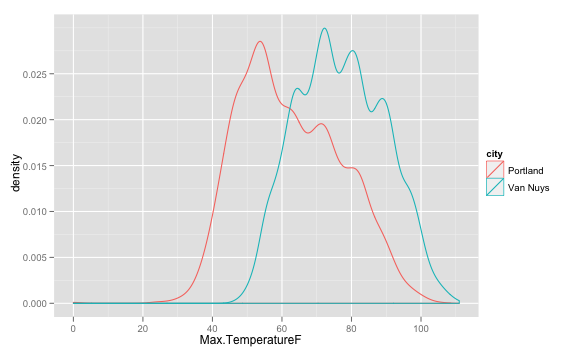 The curves are similar, obviously offset from each
other by about 20 degrees F; but the Portland curve has a sharper back
slope -- meaning that temperatures do fall in the 30-50 range, but more
often hit 50-90.
The curves are similar, obviously offset from each
other by about 20 degrees F; but the Portland curve has a sharper back
slope -- meaning that temperatures do fall in the 30-50 range, but more
often hit 50-90.
Ok, temps are interesting, but let’s see how they fall across the year.
We could look month by month, or day by day, but that feels “too
coarse” and “too granular” respectively. I chose to break things out by week of the
year. The trick here is to use as.POSIXlt() to interpret our Date,
then modulo the day of year by 7. The sapply is just to fix the case
(leap year?) where a single date would end up in the 53rd week of the
year – this just clamps them all to 52.
weather$weeknum <- sapply(1 + as.POSIXlt(weather$PST)$yday %/% 7, function(x) { min(x, 52)})
So, I really fell in love (all over again) with ggplot2 while making this graph.
Check it out:
 And the code:
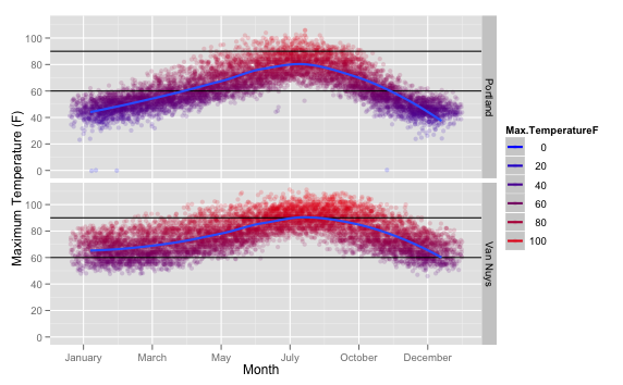
ggplot(weather, aes(x=weeknum, Max.TemperatureF, colour=Max.TemperatureF))
  + facet_grid(city~.)
  + geom_point(alpha=1/6, position=position_jitter(width=3))
  + scale_colour_gradient(low="blue", high="red")
  + geom_hline(yintercept=90) + geom_hline(yintercept=60)
  + geom_smooth(method="loess", size=1)
  + scale_x_continuous(formatter=function(x) format(strptime(paste("1990 1 ", x), format="%Y %w %U"), "%B"))
  + xlab("Month") + ylab("Maximum Temperature (F)")
Breaking it down:
- using the weather data frame we made, with
weeknumon the x axis, andMax.TemperatureFon the y axis and keying the colorization - Facet the graph (make multiple sections), one for each city in our data set
- Draw the data with points, at opacity set to 1/6, so points that get plotted a lot will end up darker, and jittered a bit to smooth things out
- Color the data points with a gradient, from blue to red. (Nice for intuitive hot/cold display)
- Put horizontal lines at 60 and 90 degrees (The points at which it starts to feel “chilly” and “hot”)
- Run a smoothed line through the whole thing to make the center more obvious
- Convert the x axis from being hard-to-comprehend “week numbers” back to months
- Then put good labels on the X and Y axis
It’s really readable, beauitful, and was actually shockingly simple to make. (Other than remapping the X axis. That was fun. The trick is to take a week number, tag it into an arbitrary year with an arbitrary day (so strptime can parse it), then reformat that date as %B, being the full date string. There’s got to be a better way…. but that worked!)
So what does the image actually tell us about the weather? Hopefully, it’s obvious. In Portland, December to February are pretty consistently chilly. In the summer, it occasionally gets hot, but between May and October it’s pretty perfect.
In Van Nuys, it’s rare to be chilly, but in June to October, get ready to run your AC.
It’s not just about the temperature
So, it’s nice not to need a sweatshirt for the temperature, but what about the gray? It can be warm and still depressingly dark outside. Thankfully, the data set includes a cloud cover metric!
Cloud Cover is a number from 0-8, representing the amount of the sky which is covered…. by cloud.
Let’s take a quick peek at the distribution with qplot, sending a
smooth line (and leaving the raw week numbers this time) through the
data:
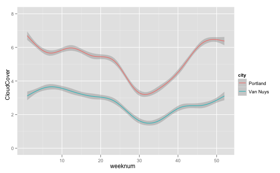
qplot(weeknum, CloudCover, data = weather, geom="smooth", color=city, span=1)
 So, the cities have similar curves, also offset (by about 3, or 37%
cloud cover). In the middle of the summer, Van Nuys typically has around
18% cover, and Portland 43%. So: Portland is Cloudy. **Myth Confirmed.**
So, the cities have similar curves, also offset (by about 3, or 37%
cloud cover). In the middle of the summer, Van Nuys typically has around
18% cover, and Portland 43%. So: Portland is Cloudy. **Myth Confirmed.**
Breaking out ggplot2, we can get a much clearer picture of how cloudy
it is:
 ```r
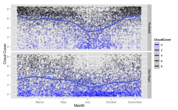
ggplot(weather, aes(x=weeknum, CloudCover, colour=CloudCover))
+ facet_grid(city~.)
+ geom_point(position=position_jitter(width=0.5, height=0.5), alpha=I(1/6))
+ geom_smooth(size=1)
+ scale_colour_gradient(low="blue", high="black")
+ scale_x_continuous(formatter=function(x) format(strptime(paste("1990 1 ", x), format="%Y %w %U"), "%B"))
+ xlab("Month") + ylab("Cloud Cover")
```
```r
ggplot(weather, aes(x=weeknum, CloudCover, colour=CloudCover))
+ facet_grid(city~.)
+ geom_point(position=position_jitter(width=0.5, height=0.5), alpha=I(1/6))
+ geom_smooth(size=1)
+ scale_colour_gradient(low="blue", high="black")
+ scale_x_continuous(formatter=function(x) format(strptime(paste("1990 1 ", x), format="%Y %w %U"), "%B"))
+ xlab("Month") + ylab("Cloud Cover")
```
It’s using basically the same method as for the temperature graph, except I modeled the cloud cover as a color range from blue to black. (Awww, cute.)
You can see something interesting when you compare it back to the temperature graphs: the cold days correlate with the cloudy days pretty well! So, the winter is sucky-cold and sucky-gray all at the same time. At least you get it out of the way all at once (while the days are short, too!)
So how nice is the spring and summer?
It’s just a perfect day
What might a perfect day look like?
- Comfortable temperature (60-90 degrees)
- Not too cloudy (Less than 50% cloud cover)
It turns out that’s an easy query to make against the data frame.
weather$ideal <- F
weather <- within(weather, {
    ideal[Max.TemperatureF >= 60 & Max.TemperatureF <= 90 & CloudCover <= 4] <- T
  })
weather$ideal <- as.logical(weather$ideal)
Make a new column called ideal and fill it with F’s, then change the
value to T wherever those conditions are met – then convert the whole
thing to a logical (boolean) type. Easy!
So now we can see where “ideal” versus “not-ideal” days fall across the
year. Week-by-week would probably be too noisy for this, so I added a
column for month to the data frame as well.
weather$month <- factor(format(weather$PST, "%B"), order=TRUE, levels=c("January", "February", "March", "April", "May", "June", "July", "August", "September", "October", "November", "December"))
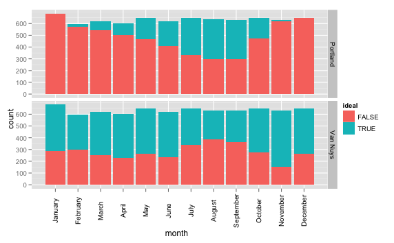 A much simpler incarnation of `ggplot` this time:
```r
ggplot(weather, aes(x=month, fill=ideal))
+ geom_histogram()
+ facet_grid(city~.)
+ opts(axis.text.x = theme_text(angle=90, size=10)))
```
A much simpler incarnation of `ggplot` this time:
```r
ggplot(weather, aes(x=month, fill=ideal))
+ geom_histogram()
+ facet_grid(city~.)
+ opts(axis.text.x = theme_text(angle=90, size=10)))
```
And the results are again interesting; I would not have bet on November having the most ideal days here in Southern California, but it makes sense. And, July-September, over 1/2 the Portland days are ideal ones! (cough, like basically every month in Van Nuys.)
(Of course, anyone who’s been to Van Nuys can attest to the fact that, no matter how great the weather is, you’re very unlikely to have a perfect day in general. Because you’re in Van Nuys.)
So just to quickly summarize the data:
ideal_days <- weather[weather$ideal==TRUE,]
qplot(city, data=ideal_days)
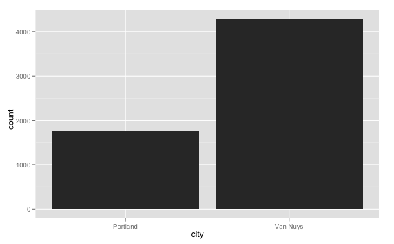 Portland has about 42% of the "ideal days" that Van Nuys does. Which, given everything else that [Portland's got going for it](http://www.youtube.com/watch?v=AVmq9dq6Nsg) is actually still a pretty good result.
That gives me an idea… I bet I can point R at some Crime, Traffic, School, and Cost of Living statistics to get a more well-rounded picture :)